In design, colors aren’t just pretty visuals; they’re powerful tools that can stir emotions, shape perceptions, and create captivating user experiences. Using color in design goes beyond aesthetics – they possess a remarkable ability to make a website pop, evoke emotions, and leave a lasting impression on visitors like yourself. As designers, we wield this knowledge like a secret weapon, allowing us to create brands and websites that genuinely resonate with audiences.
The Power of Color on Emotions:
Picture this: you land on a website, and it instantly makes you feel calm, excited, or inspired. That’s the magic of color at work. By understanding how colors make people feel, careful placement and usage can resonate with users to get the desired emotional response. Each color has its own emotional weight, shaping the whole experience. Strategically choosing colors, can guide users through a visual journey that hits them right in the feels and takes their experience to a whole new level.
Exploring the Impact of Colors on Web Design:
Okay, now it’s time to explore the color palette. Here’s a breakdown of different colors and how you can effectively use them in your branding or on your website.
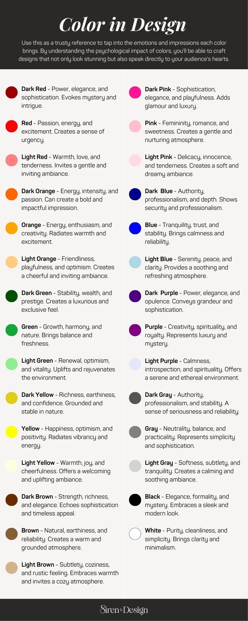
Remember, the way you use these colors in your web design can greatly impact the emotions and perceptions of your audience. So, choose your colors wisely and let them work their magic to create a visually stunning and emotionally engaging online presence.
Bringing Your Branding & Website to Life:
Now, let’s unlock the key to transforming your web design through the magic of color. Here are some tips to guide you on this creative journey:
1. Know Your Audience
You gotta understand who you’re designing for. Think about their preferences, cultural associations, and the emotions you wanna stir up with your color choices.
2. Create Harmonious Palettes
Mix and match colors that go well together. For example, you can use shades of the same color (monochromatic) or colors that are next to each other on the color wheel (analogous). The goal is to achieve a visually pleasing combination that works harmoniously.
3. Set the Right Tone
Colors have a language of their own. Warm tones bring energy and positivity, while cool tones evoke calmness and serenity. Choose your colors wisely to match the vibe you’re going for.
4. Guide User Attention
Let colors guide the way! Use contrasting shades or vibrant pops of color to draw attention to important elements. It’s like giving them a neon sign that says, “Hey, check this out!”
5. Ensure Accessibility
Design isn’t just about looks; it’s about inclusivity too. Make sure your color choices are accessible to everyone. Consider contrast for better readability, and provide alternatives for color-blind users. Let’s make your design rock for all.
To make sure you have all your bases covered, here are a few more important tips you should be taking into consideration.
Now, armed with this knowledge, it’s time for you to dive in and explore the endless possibilities. Whether you’re revamping your existing website or starting a brand new project, remember that color is your secret weapon to create a memorable and engaging user experience. May your websites be filled with beauty, emotion, and the undeniable charm of a perfectly crafted color palette. Don’t be afraid to experiment with different color combinations, unleash your inner artist, and bring your unique vision to life.
If you ever need a helping hand in designing a website that truly reflects your brand and resonates with your target audience, remember that I’m here for you. Together, we’ll make your online presence shine brighter than ever before.
Leave a Reply
My Services
I'm here to take the stress out of design and elevate your online presence. Whether you're a small business owner or a creative professional, I'll work closely with you to create a website that aligns perfectly with your goals and vision.
The Philosophy
Making genuine connections and empowering brands to thrive online by creating meaningful websites through collaboration, innovation, and purpose-driven design. I strive to create impactful online presences and deliver exceptional user experiences.
.






Be the first to comment